Matplot点状图绘图初探

目录
  1. 代码目标与架构思路
    1. 目标
    2. 思路
  2. 涉及函数及参数简介
    1. axis参数
    2. meshgrid
    3. linspace
    4. flat
    5. stack
    6. ListedColormap
    7. xlim(ylim)
    8. pcolormesh
    9. reshape
    10. scatter
    11. 坐标轴的标签函数
  3. 代码
TOC

完成鸢尾花数据集后,突然发现还要求一个直观的Matplot展示,不得已,尝试捡起丢掉已久的matplot和numpy。


代码目标与架构思路

目标

将模型训练的结果直观化,形成一张彩色的图谱,图谱上有训练点和背景分区,当点的颜色和背景颜色不一致时,认为模型判断失误,否则模型预测成功。

思路

利用numpy生成一张500 * 500的数据矩阵作为背景,将其中的点全部通过模型预测( 需要重新训练只接受两个点的模型,因为一张二维图只有两个参数 ),并将显示结果通过不同颜色加以区分,形成色块,以此形成带颜色的背景。

再将真实值( 训练数据 )绘制成点标于其上即可。


涉及函数及参数简介

axis参数

用于指定对矩阵的堆砌和拆分遵循行还是列,有0和1两种指标。

meshgrid

用于形成网格,分别输入需要形成网格的横纵坐标集合,输出网格的两个坐标的矩阵形式。

上属:numpy

linspace

用于形成等差数组,输入依次为这个要形成的数组的最小值,最大值,数组元素个数,输出为数组。

上属:numpy

flat

用于将一个矩阵“扁平化”成一个数组,扁平化顺序一定。

上属:相应矩阵

stack

用于将两个大小相同的矩阵/或数组堆叠起来(axis参数为1时相当于取两个矩阵/数组位置相同的元素组合为一个坐标作为它新矩阵的元素)。输入为两个待处理矩阵和axis参数,输出为堆叠的矩阵。

上属:numpy

ListedColormap

用于形成后面上色的规则 cm( Colormap ),格式为输入[‘XX’,’XX’,’XX’],式中的XX表示颜色缩写或者具体编号,一般用RGB格式,其顺序就是上色顺序,因此数量和要上色的元素数量有关。输出为cm。

上属:matplotlib.colors

xlim(ylim)

设定显示的坐标轴范围,输入为(min,max),无输出。

上属:matplotlib.pyplot

pcolormesh

用于绘制分类背景,使得背景出现颜色。输入依次为需要构造的横纵坐标x1,x2,判定颜色的依据label,判定颜色的规则cmap = cm,无输出。

上属:matplotlib.pyplot

reshape

用于调整相应矩阵大小,输入为需要调整成的结果,同样是一个矩阵,由于是直接的下属函数,无输出。

上属:相应矩阵

scatter

用于绘制一连串有颜色的点作为标记点。输入依次为一串点的横纵坐标x1,x2,判定点的颜色的依据 c = label,判定点颜色的规则 cmap = cm,点的形状 maker, 点边缘颜色 edgecolors,无输出。

上属:matplotlib.pyplot

坐标轴的标签函数

xlabel/ylabel:设定xy轴名称。输入相应字符串,无输出。

title:设定图像名称。输入相应字符串,无输出。

上属皆为:matplotlib.pyplot


代码

贴上代码,里面已经有注释了,思路简单,故不再赘述。

1
2
3
4
5
6
7
8
9
10
11
12
13
14
15
16
17
18
19
20
21
22
23
24
25
26
27
28
29
30
31
32
#绘图部分:
#切割数据,只要前两个特征
x_train = x_train[:,0:2]
#重新训练模型
my_model_2 = neighbors.KNeighborsClassifier(5)
my_model_2.fit(x_train,lab_train)
#绘图点数量:
m,n = 500, 500
#print(x_train)
x1_min,x2_min = x_train.min(axis = 0)
x1_max,x2_max = x_train.max(axis = 0)
#绘制网格
x1, x2 = np.meshgrid(np.linspace(x1_min, x1_max, m), np.linspace(x2_min, x2_max, n))
#将数据点堆叠起来形成数据集合
x_plot = np.stack((x1.flat,x2.flat),axis = 1)
#print(x_plot)
#利用模型预测
lab_predict = my_model_2.predict(x_plot)
#设定颜色
cm_color= ListedColormap(['r','g','b'])
#设定范围
plt.xlim(x1_min,x1_max)
plt.ylim(x2_min,x2_max)
#绘制分类背景
plt.pcolormesh(x1, x2, lab_predict.reshape(x1.shape), cmap=cm_color)
#绘制点
plt.scatter(x_train[:,0],x_train[:,1],c=lab_train, cmap = cm_color, marker= 'o',edgecolors='k')
#坐标信息
plt.xlabel("Sepal.Length")
plt.ylabel("Sepal.Width")
plt.title("KNN for Iris")
plt.show()

加上完整的前后文后效果如下:

KNN for Iris

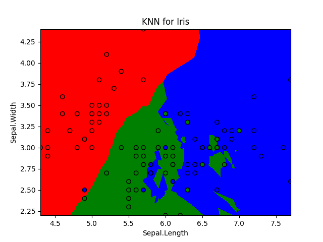
可以看到,效果还是很不错的,颜色不相同的地方就是模型判断失误的地方。

最后贴上完整代码:

1
2
3
4
5
6
7
8
9
10
11
12
13
14
15
16
17
18
19
20
21
22
23
24
25
26
27
28
29
30
31
32
33
34
35
36
37
38
39
40
41
42
43
44
45
46
47
48
49
50
51
52
53
54
55
56
57
58
59
60
61
62
63
64
65
66
67
68
69
70
71
72
73
74
75
76
77
78
79
80
81
from sklearn import neighbors
from sklearn import metrics
from sklearn.datasets import load_iris
from sklearn.model_selection import train_test_split
from matplotlib.colors import ListedColormap
import matplotlib.pyplot as plt
import numpy as np

# 用于处理及观察数据集结构
def load_data():
data = load_iris()

#数据结构
print("数据结构:")
print("关键字:",data.keys())
print("target:",data.target)
print("frame:" ,data.frame)
print("target_names:" ,data.target_names)
print("DESCR:" ,data.DESCR)
print("feature_names:" ,data.feature_names)
print("filename:" ,data.filename)
print("data_module:" ,data.data_module)

#数据拆分,按7:3划分
x_tain,x_test,lab_train,lab_test = train_test_split(data.data,data.target,test_size = 0.3)
return x_tain,x_test,lab_train,lab_test


#主函数
def main():
x_train,x_test,lab_train,lab_test = load_data()
print("------------ training and testing")
#建立KNN模型
my_model = neighbors.KNeighborsClassifier(5)
#训练模型
my_model.fit(x_train,lab_train)
#对结果进行预测
lab_pre = my_model.predict(x_test)
#将预测结果和实际结果相比较打分
print("score:",metrics.accuracy_score(lab_test,lab_pre))
#尝试另一种函数:
print("score:",my_model.score(x_test,lab_test))

#绘图部分:
#切割数据,只要前两个特征
x_train = x_train[:,0:2]
#重新训练模型
my_model_2 = neighbors.KNeighborsClassifier(5)
my_model_2.fit(x_train,lab_train)
#绘图点数量:
m,n = 500, 500
#print(x_train)
x1_min,x2_min = x_train.min(axis = 0)
x1_max,x2_max = x_train.max(axis = 0)
#绘制网格
x1, x2 = np.meshgrid(np.linspace(x1_min, x1_max, m), np.linspace(x2_min, x2_max, n))
#将数据点堆叠起来形成数据集合
x_plot = np.stack((x1.flat,x2.flat),axis = 1)
#print(x_plot)
#利用模型预测
lab_predict = my_model_2.predict(x_plot)
#设定颜色
cm_color= ListedColormap(['r','g','b'])
#设定范围
plt.xlim(x1_min,x1_max)
plt.ylim(x2_min,x2_max)
#绘制分类背景
plt.pcolormesh(x1, x2, lab_predict.reshape(x1.shape), cmap=cm_color)
#绘制点
plt.scatter(x_train[:,0],x_train[:,1],c=lab_train, cmap = cm_color, marker= 'o',edgecolors='k')
#坐标信息
plt.xlabel("Sepal.Length")
plt.ylabel("Sepal.Width")
plt.title("KNN for Iris")
plt.show()


if __name__ == '__main__':
main()

锵锵锵~完成

DAR
SON